

STUDIO X DANCE COMPLEX
Full Branding Initiative
DANCE & FITNESS DEVELOPMENT
Studio X is an all-in-one dance studio complex in Rancho Cucamonga, focusing on enriching the lives of today’s youth through ballet, jazz, hip-hop, contemporary, and jazz styles of dance. ABD was approached by Studio X’s founder Lia Bourne to create the entire look and feel of the brand from logo to website and everything in between. She wanted a brand that was timeless, severely minimal and fresh. The studio focused on youth between the ages of 5-18, so the brand and identity could not be too juvenile nor too mature.
Logo • Website • Social Media Design & Management • Collateral Design • Apparel
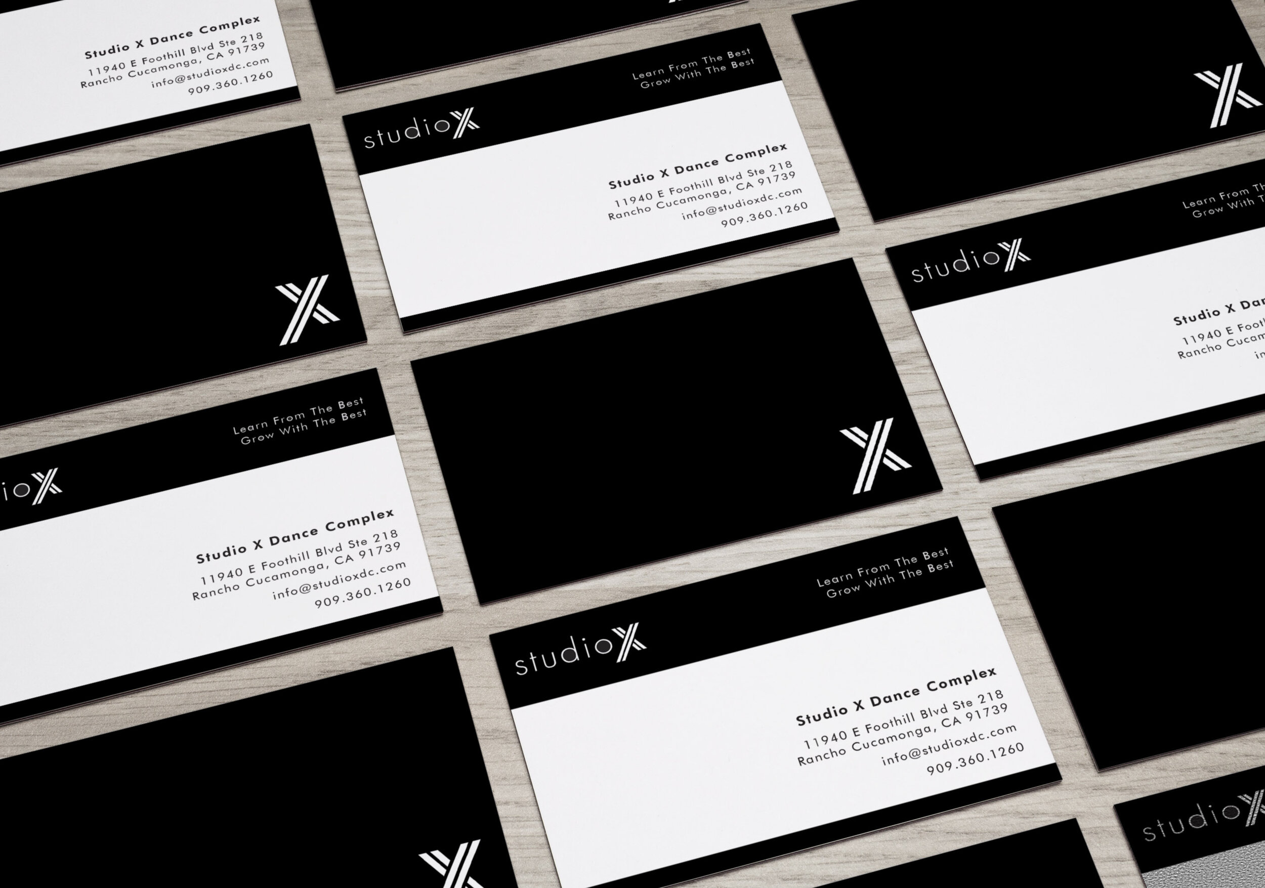
LOGO
The desired focus of the logo was the “X”. Lia wanted an iconic “X” that had presence and slightly futuristic. We started with a bold “X” and started experimenting with aways to tweak and deconstruct the letter.
The word “Studio” was to be secondary to the “X” in appearance and we achieved the look by experimenting with thin san-serif fonts. Ultimately we chose Futura Light as the primary font. It exuded sterility while maintaining a timeless look.

BEHIND THE SCENES: LOGO PROCESS

ADDITIONAL LOGO EXPLORATIONS


STUDIO X OFFERS SOMETHING GREATER
Their mission is to provide their students with masterful instruction in a positive and supportive environment, that encourages creativity, confidence, and internal motivation. They strive to teach their students to be thinkers, leaders, and performers. Teamwork is essential to success and they are committed to building a space where their students, teachers, and parents effectively communicate and work together.

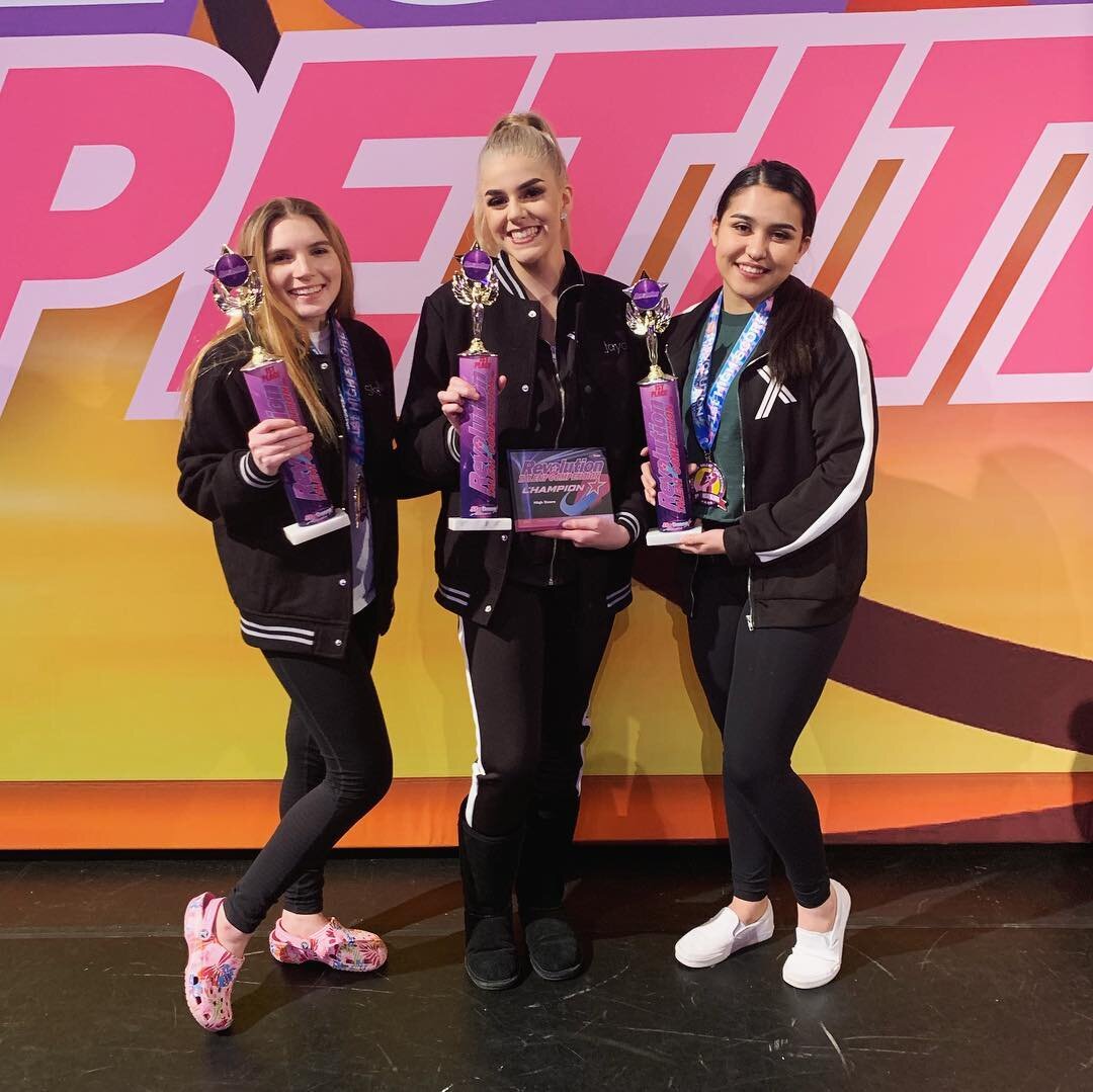
SOCIAL MEDIA DESIGN
ABD has extended their relationship with Studio X by continuing to develop and craft their Instagram and email social media content. We design across their entire spectrum including flyers, competitions, lifestyle and empowerment workshops, and events as well as craft their Instagram Story social media content.

WEBSITE DESIGN
ABD also crafted a website for Studio X that was minimal, approachable, parent-friendly, and timeless. Short headlines and a black and white aesthetic gave the website just enough personality. Bold and engaging opening banners draw the viewers in, while minimal type keeps all copy legible and easily-digested.


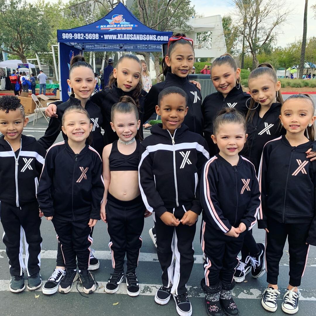
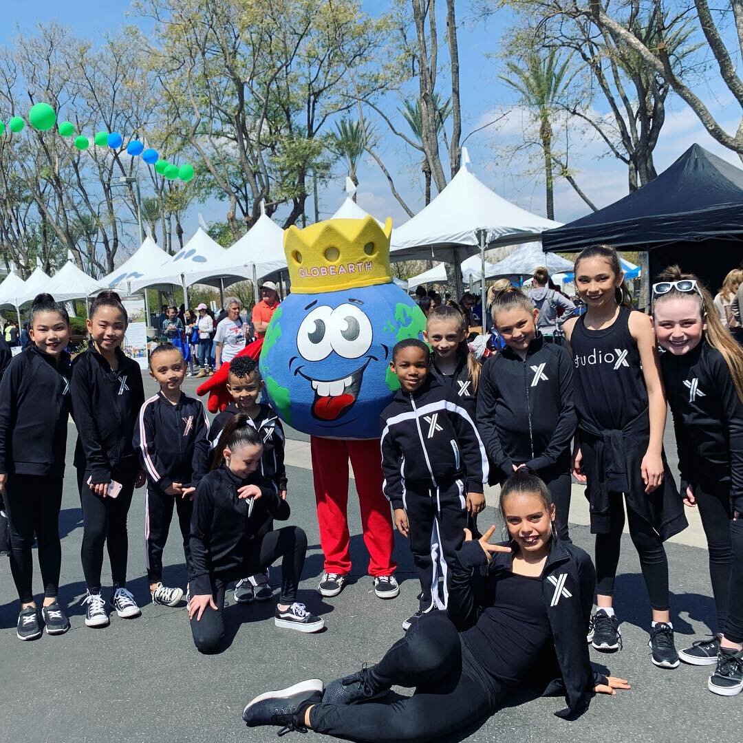
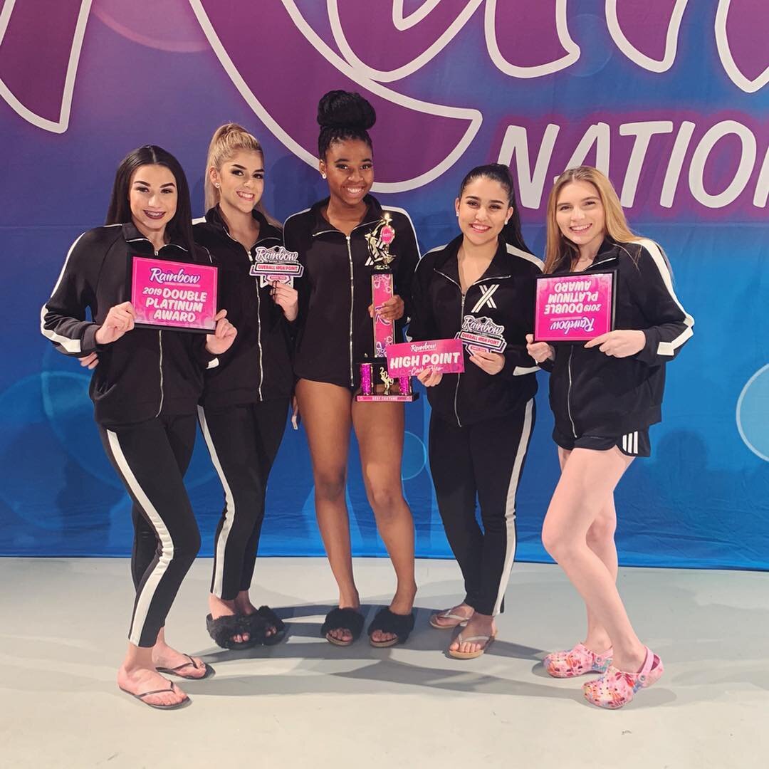
APPAREL DESIGN
We began to experiment with using the iconic “X” on t-shirts, sweats, warm-up suits, and buttons. The brand continued to extend into parent jackets, flags, and still continues to expand currently.

LEARN FROM THE BEST.
GROW WITH THE BEST.
