PKP INVESTMENTS
Full Branding Initiative
REAL ESTATE & INVESTING
Creative Direction
Full Collateral Suite
Website Design
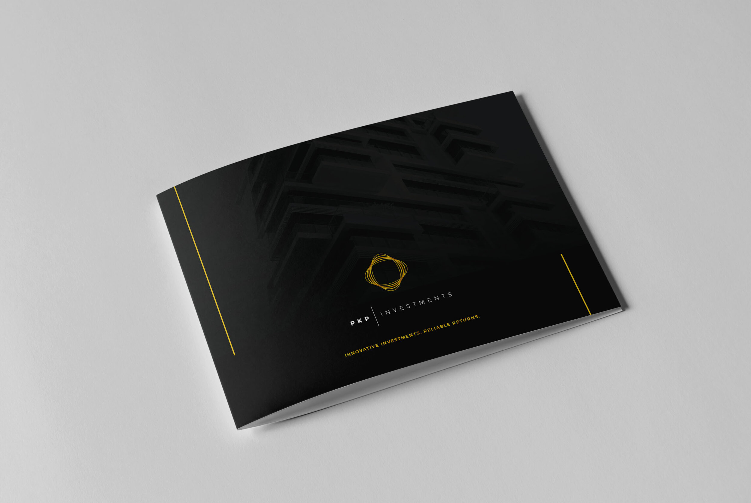
PKP Investments (composed of our clients Paraag, Ketan and Paresh) is a new real estate investment firm looking to position themselves in the higher tiers of investment opportunities with the global elite. They were very adamant about achieving a powerful and modern look with a touch of class.
ABD worked in partnership with Maxa Design Agency to slowly build out each piece of this branding initiative with patience and the utmost attention to detail. We started with a strong mood-board of structural and architectural images and built around that.
Additional Creative Directors: Erik Gallardo (@_amerikanerik) & Ocean Rodriguez

PRIMARY LOGO
LOGO
We needed a mark that was simple yet powerful. It had to represent growth, movement, energy and all walks of life: hallmarks important to PKP. Yellow and gold were chosen as our standout colors because of their intellectual and positive symbolism. Yellow has a positive, worldly feel and we believe it captured the essence of PKP’s clientele globally. Gold speaks to luxury and quality, also pieces of PKP’s overall aesthetic.
We then played with type treatments and explored to our hearts’ content.
Our goal was to create a logo and type treatment that would work well together and independently as well.
ADDDITIONAL LOGO VARIATIONS

STACKED LOGO

ICON
SECONDARY BUSINESS CARD TREATMENT


PRIMARY BUSINESS CARD TREATMENT

EMAIL SIGNATURES


WEBSITE
The website needed to embody strength and loyalty, so we decided to use striking black and white architectural and structural imagery as the backdrop.
We then introduced accents of our yellow and gold hues throughout the entire website and kept the copy visually appealing with bold headlines and simple lines of type.
Custom info-graphs were created to highlight PKP’s unique business models and we kept to organic, circular forms to reinforce movement and evolution.