

CORPORATE CHAIR: Massage & Wellness
Full Company Rebrand
MASSAGE THERAPY
Corporate Chair: Massage and Wellness is a health and wellness company started by Massage Therapist Michelle Morris. She was in a transitional point with her company and wanted to elevate the look and feel of the brand in order to appeal to major companies and corporations. Michelle already had an existing brand, but the brand messaging and overall look were nonadhesive and lost. We wanted to enhance the brand that Michelle already had while highlighting all the amazing components of the company in a sleek and demure way. We chose to create a balance between light and dark with the new brand using white space to our advantage for major areas of copy, while contrasting it with moody, dark photos.
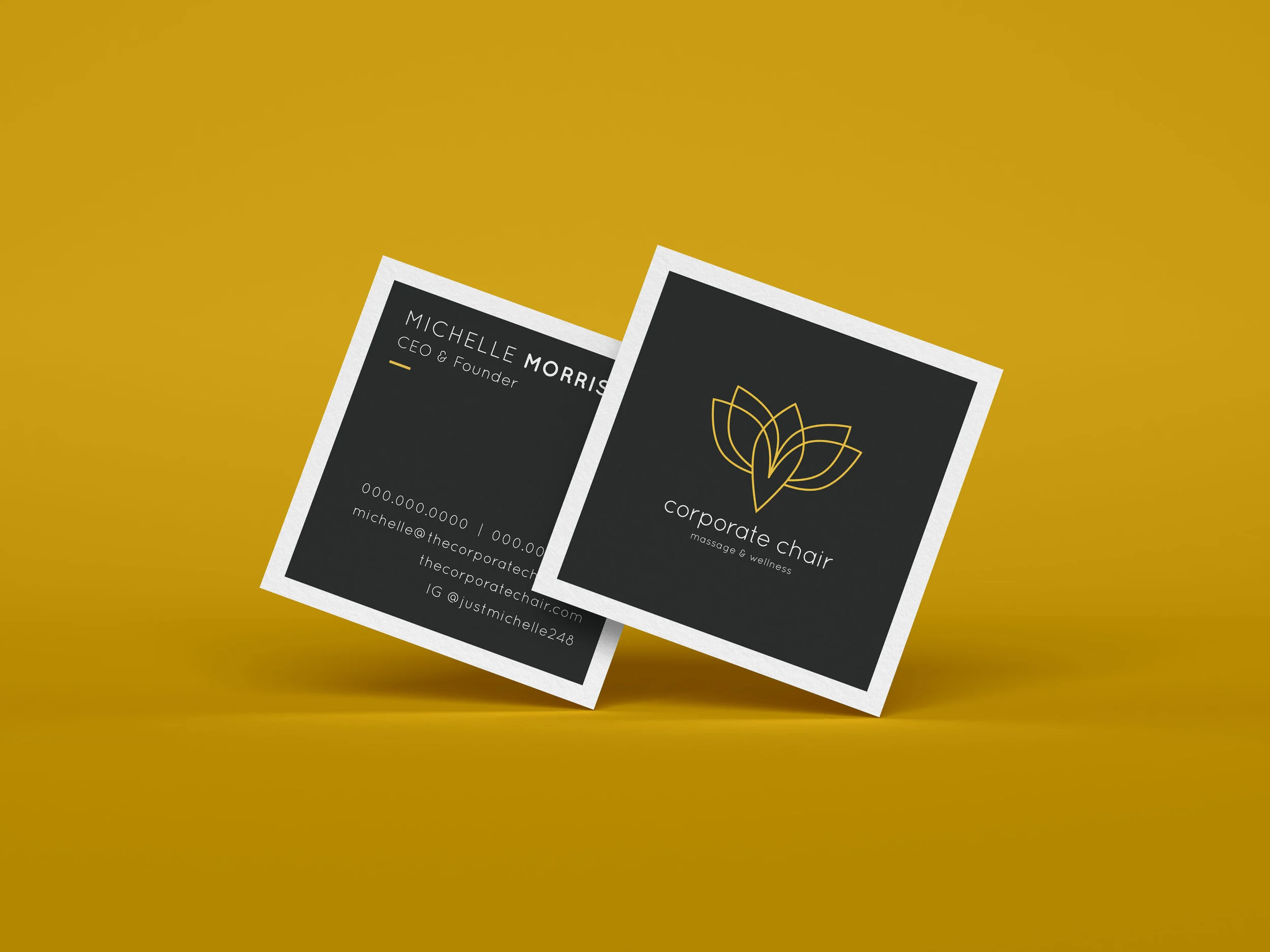
Logo • Website • Mini Collateral Suite (business card, brochure and email signature)
LOGO
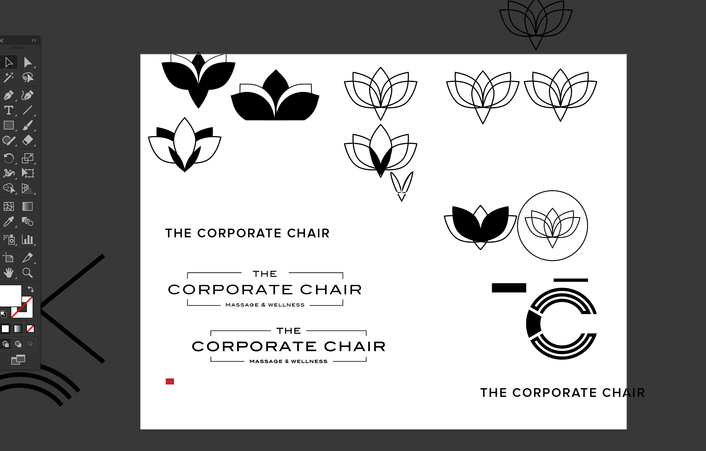
Corporate Chair’s new logo needed to be transformational and striking. We proposed three different directions to Michelle: a simple typographic treatment, a lettermark option (letter “C”), and an abstract approach to a lotus. Ultimately, Michelle chose the abstract approach as her favorite for its transformative qualities and delicate feminine details.

Michelle loved the abstract and transformative quality of the logo: a lotus, butterfly, and human can all be seen upon a second look.
OLD LOGO

BEHIND THE SCENES: LOGO PROCESS
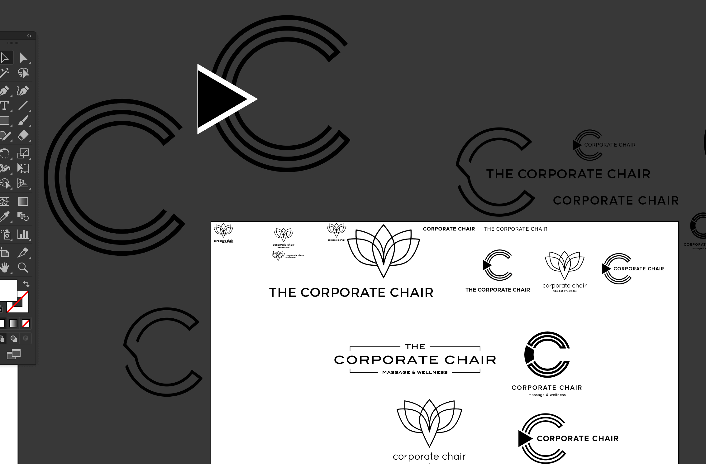
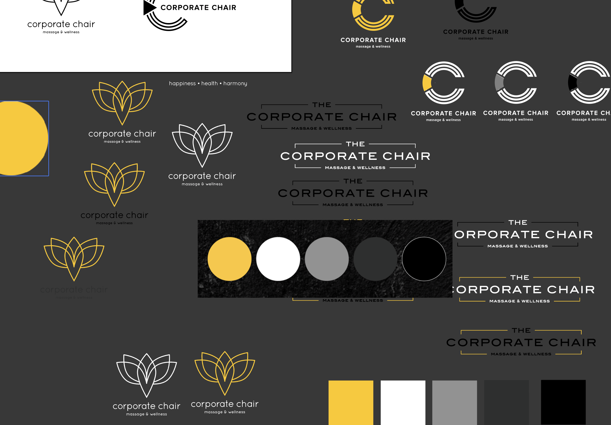
ADDITIONAL LOGO EXPLORATIONS


WEBSITE
The website needed to serve as a simple touchpoint for Corporate Chair. We decided to go with a clean one-pager site that would be informational and visually impactful. Michelle wanted to give a little lead-in about who Corporate Chair was and what the company believed in. We muted the site down with grey overtones for the photos and pure white type. Yellow was used as a highlight color for the site, bringing in a little brightness every now and again.


